Reframing Aspect Ratios
Snakes and Cowboys
This is the second part of a two-part series on aspect ratios. The first part was a brief history of changing aspect ratios; this second part pertains to aspect ratios in our modern, mobile world.
The Phone Problem
After decades of screens (at home and in the theaters) getting larger and more horizontal, suddenly everyone has a small, vertical1 screen in their pocket.
In the VHS days, we lost about 25% of the image cropping widescreen to fullscreen. Opening the Super 35 matte added about 33% (depending on the proportions of the original widescreen.)
But if you want to crop a shot for a vertical mobile phone, a standard 16:9 shot to fit a 9:16 phone means losing nearly 70% of the picture!
Filmmakers at Quibi (remember Quibi?) were required to compose shots such that they could be viewed in either orientation, which led to monstrosities like this—
The Algorithm is a Harsh Mistress
When I make my long form video essays, I try to find the highest resolution picture possible, and then letterbox or pillarbox the image to fit 16:9. I assume (hope) most people are watching my videos on at least a laptop, if not a TV.
But YouTube all but demands that creators cater to the mobile viewer, particularly with the YouTube Shorts program. These are videos that are under a minute and framed vertically,2 both features optimized for your cell phone.
This leaves me, a cinephile who’s had too much film school, in a bind. Can I possible crop classic films just to get more views on YouTube?
But unlike some content mills I’ve seen, I don’t just cut the center out of shots. I meticulously reframe every shot by hand, to make sure it’s as pleasing to the eye as possible, even though that eye is likely staring at it through a cell phone.
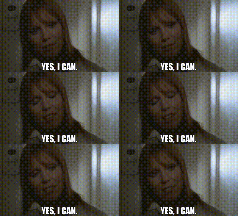
Here’s an original short I made (as opposed to a clip from one of my video essays), mashing together Seven and Snow White and the Seven Dwarfs—
Compare that with the uncropped, widescreen version—
The first thing you’ll notice is that there’s no sense of location in the vertical version. Fluorescent lights behind Morgan Freeman imply it’s an office space, but that’s about it. You can hardly tell the Snow White scenes are from throughout the movie, because the backgrounds are so indistinguishable.
While the portrait aspect ratio frames the human body quite well, a two shot, much less a crowd shot, is basically impossible. You’d be forgiven if you didn’t even realize Brad Pitt was even in the Seven scene. You definitely can’t see the extras. Likewise, Dopey gets cropped out of a few shots, too.
I was also forced to create several extra camera moves, just to keep the relevant information in-frame. This aspect is even more pronounced when you compare two versions of my quick video about Who Framed Roger Rabbit and Harvey.
The camera moves are unfortunate, because the whole point of the scene is that Roger and Eddie are trapped; they can’t move, and the camerawork reflects that. And here I come blundering in, trying to make it so you can see two characters in a frame meant for one.
The Value of Vertical
Don’t get me wrong, there are benefits to a vertical frame. It definitely fits the human body nicely, which is why painters have been using portrait canvases for centuries.
In a dialogue-heavy scene, it focuses the viewer on the speaker. Which is arguably the flip side of nuance; there’s only one point of interest, so the eye isn’t inadvertently drawn to the waitress or the little person or the bright window the background.
Honestly, that’s about it.
It’s Moving, But is it a Movie?
In my previous post, I implied there is no “right” aspect ratio; it’s up the preferences and tastes of the filmmakers. I don’t think that’s quite right. After spending many hours re-framing shots to fit cell phones, I think there is something lacking in vertical video.
Vertical video is about performance and script, not mise en scène. There’s basically only one way to compose a shot. You’ll notice in most videos shot spontaneously by amateurs with their phones, they’ll keep the subject centered in the frame and ignore everything else.
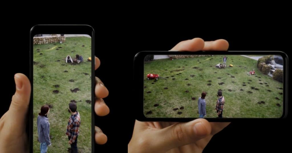
Damien Chazelle, with what I’m sure was a massive amount of funding through Apple, attempted to create a cinematic short in a vertical, 9:16 aspect ratio—
Many of the shots work, but many of them feel either entirely too cramped, or have a ton of wasted space. The best tend to be either full-body or cowboy shots (as shown in the thumbnail above).
I think that issue is, ultimately, while our bodies are vertical, our lives are horizontal. We move forward and backward, left and right. We almost never move up and down; we rarely even look up or down.
When I was in college, my friends and I would sneak onto the roofs of buildings around campus. We could hang out for hours, looking down on the crowds, and never get caught. No one ever looked up.
We’re used to our eyes bouncing left and right, scanning a frame for new information. Studies show we particularly like looking at human faces—
As I learned in reframing shots from several classic movies, the face is what we get, and not much else.
Widescreen may be for snakes and funerals, but vertical video is for cowboys.
Yes, unlike television sets or movie theater screens, we can rotate our phones sideways, but that doesn’t change the fact it’s more comfortable to hold it vertically.
If you have a video that’s under a minute but widescreen, YouTube will actually crop it and force it to become a short.


